Within’ Wine
Senior Capstone
Witchin’ Wine is a winery founded in 2020 in Salem, Massachusetts. The brand draws inspiration from the history, culture, and enduring fascination with witchcraft associated with the region. The name “Witchin’ Wine” is inspired by the slang expression “bitchin’,” commonly used to describe something exceptionally good. Because the word “bitchin’” closely resembles “witchin’,” and the wines are crafted to deliver a high-quality taste and experience, the name reflects both the playful spirit and the identity of the brand.
The goal of Witchin’ Wine is to provide natural wines for individuals who are mindful of ingredients and prefer simple, recognizable components. This philosophy also resonates with members of the Wiccan community, whose practices often emphasize a connection to nature. In addition to offering fresh, natural wines, Witchin’ Wine aims to foster a welcoming and supportive community for those interested in witchcraft, whether they are new to the practice or more experienced.
Project Scope
~ Conduct independent research to design and produce a cohesive visual identity for Witchin’ Wine, including a logo, five wine labels, a tasting menu, a brochure, and a website.
~ Apply previously acquired knowledge of design fundamentals, packaging design, illustration, typography, Photoshop, and layout to all project components.
~Produce high-quality, professional final deliverables.
~Engage in ongoing self-evaluation and incorporate instructor feedback when appropriate to refine the work.
~ Develop a cohesive and successful design across all elements, demonstrating strong attention to detail throughout.
Objectives
~Logo
~5 Wine Bottle Labels
~Brochure
~Tasting Menu
~Website
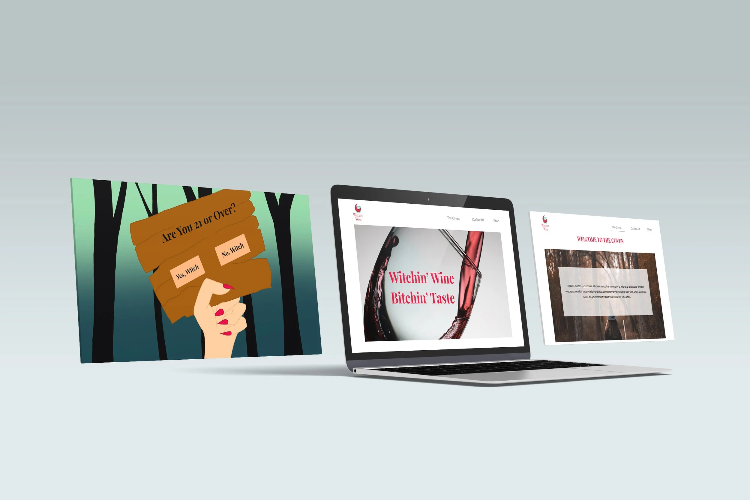
Splash page
homepage
coven page
contact page
Deliverables
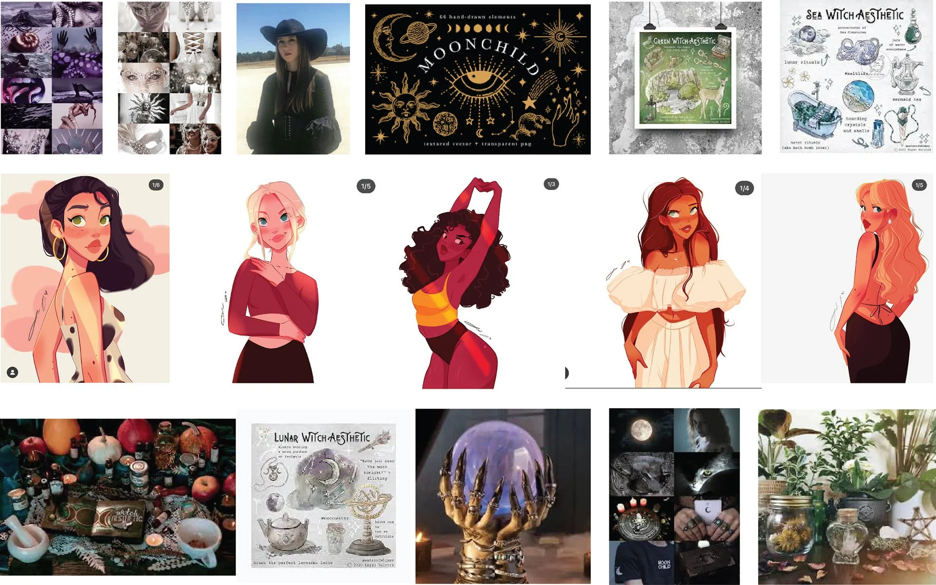
To develop a successful brand design for Witchin’ Wine, I began by researching competing wine brands. During this research, I observed that many wine labels rely on dark, sophisticated color palettes and are primarily typography-based. As a result, many bottles share a similar aesthetic, creating a somewhat uniform and predictable appearance across the market.
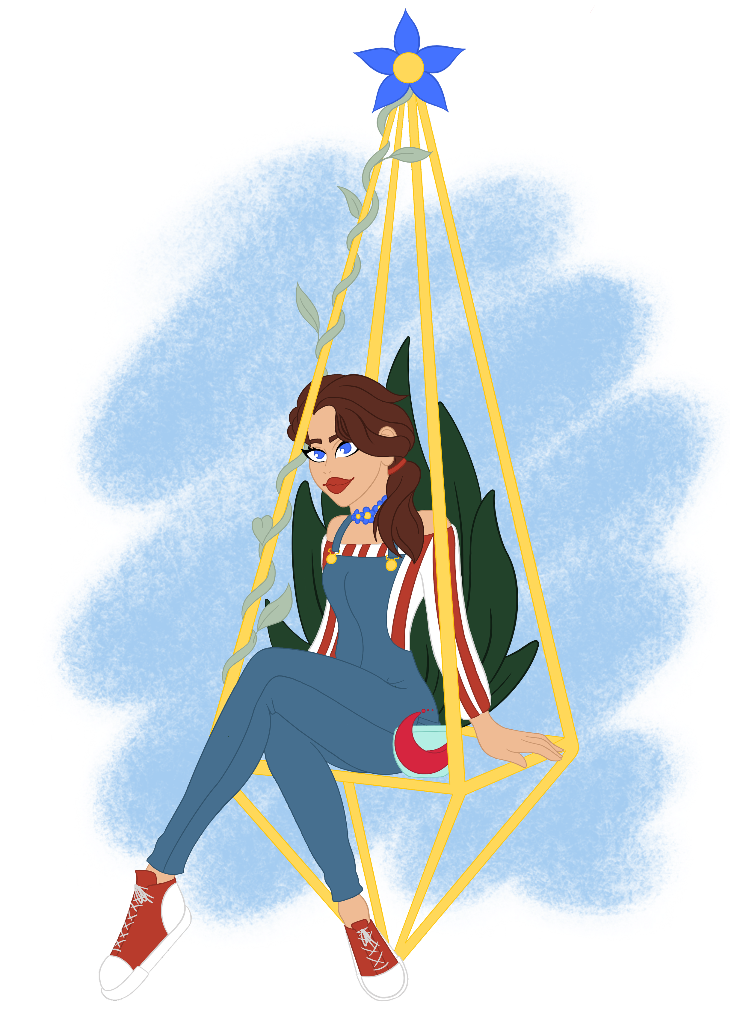
To differentiate Witchin’ Wine from these conventional designs, I explored visual styles that felt more fun, inviting, and distinctive. After spending time exploring visual inspiration on Instagram, I discovered a simple, realistic character illustration style that stood out to me. I then researched techniques for simplifying human features and forms in order to consistently replicate this style throughout the brand.
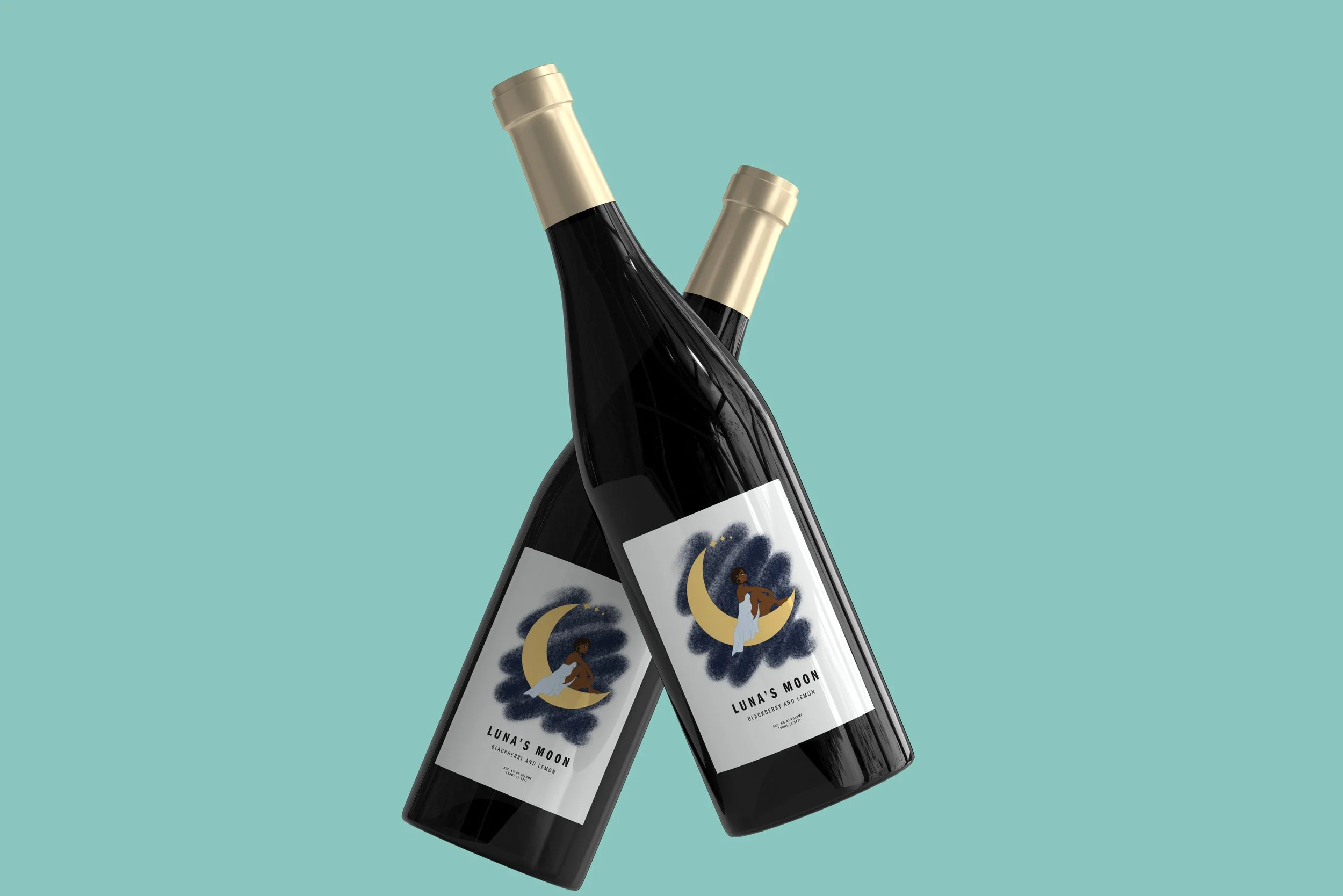
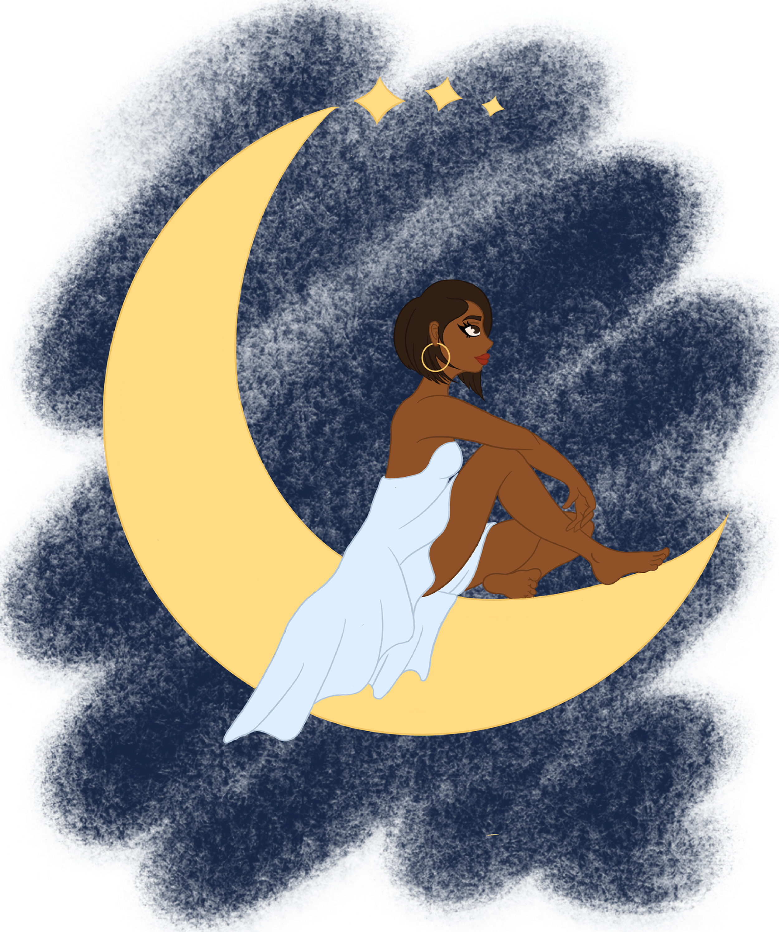
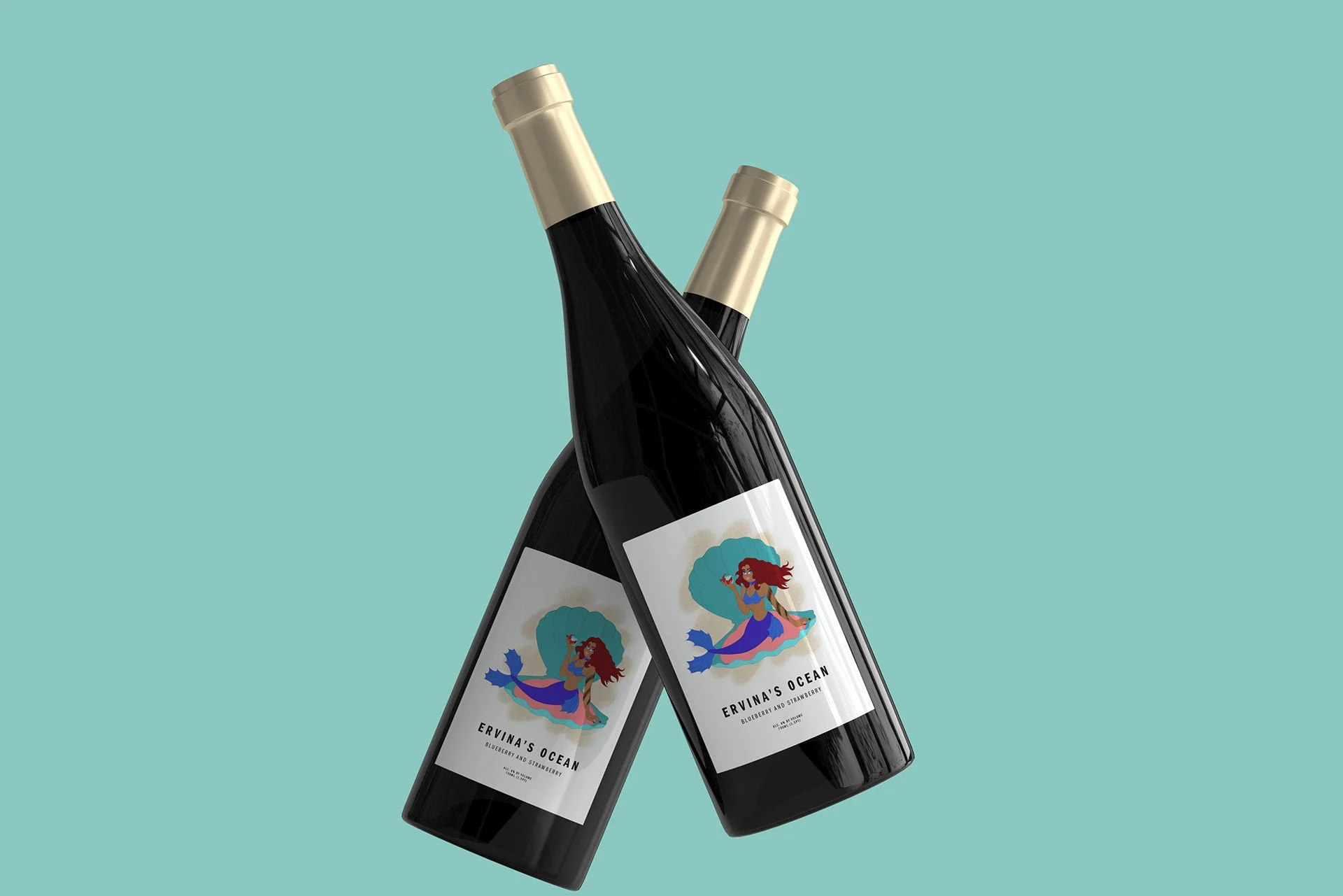
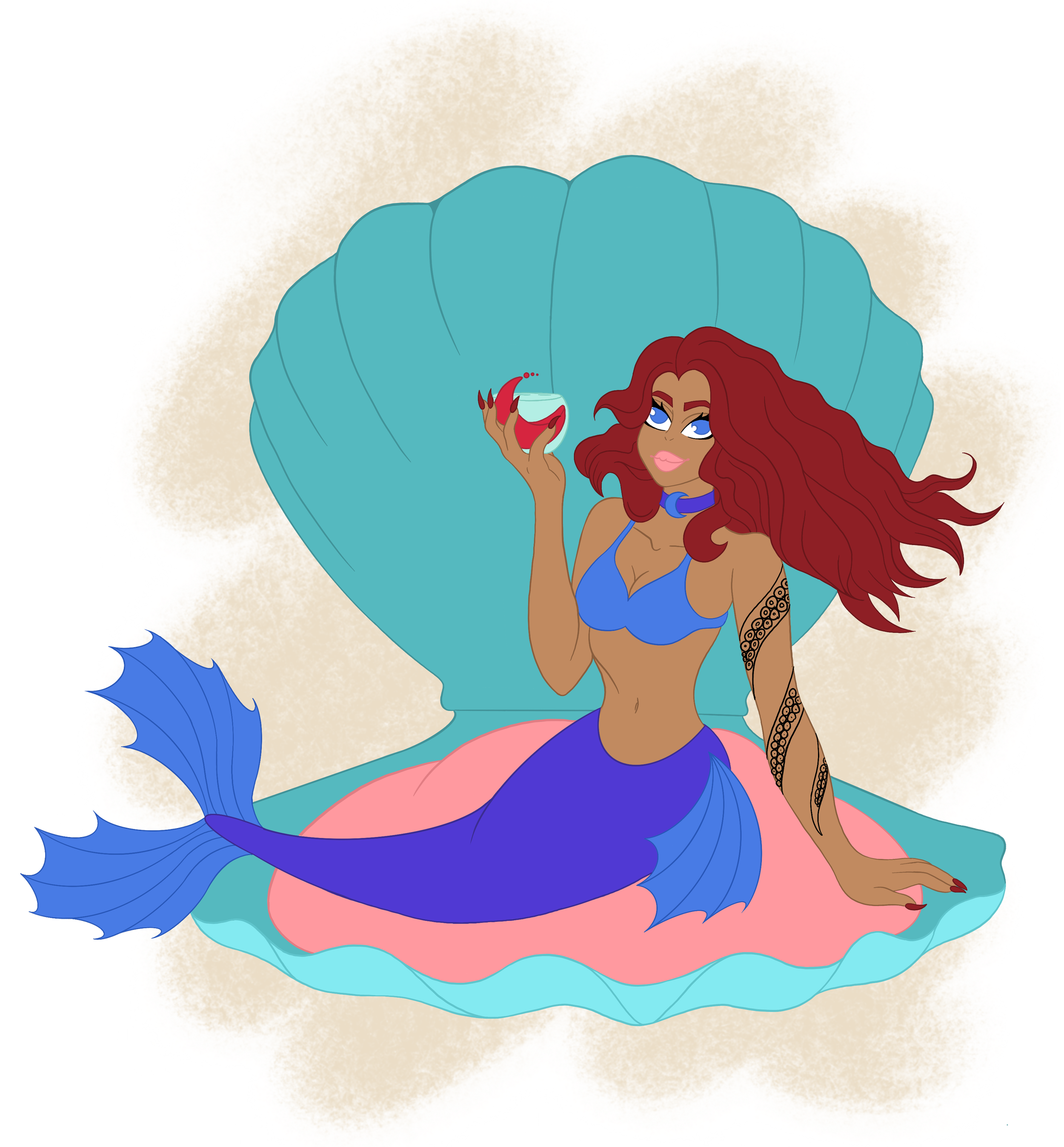
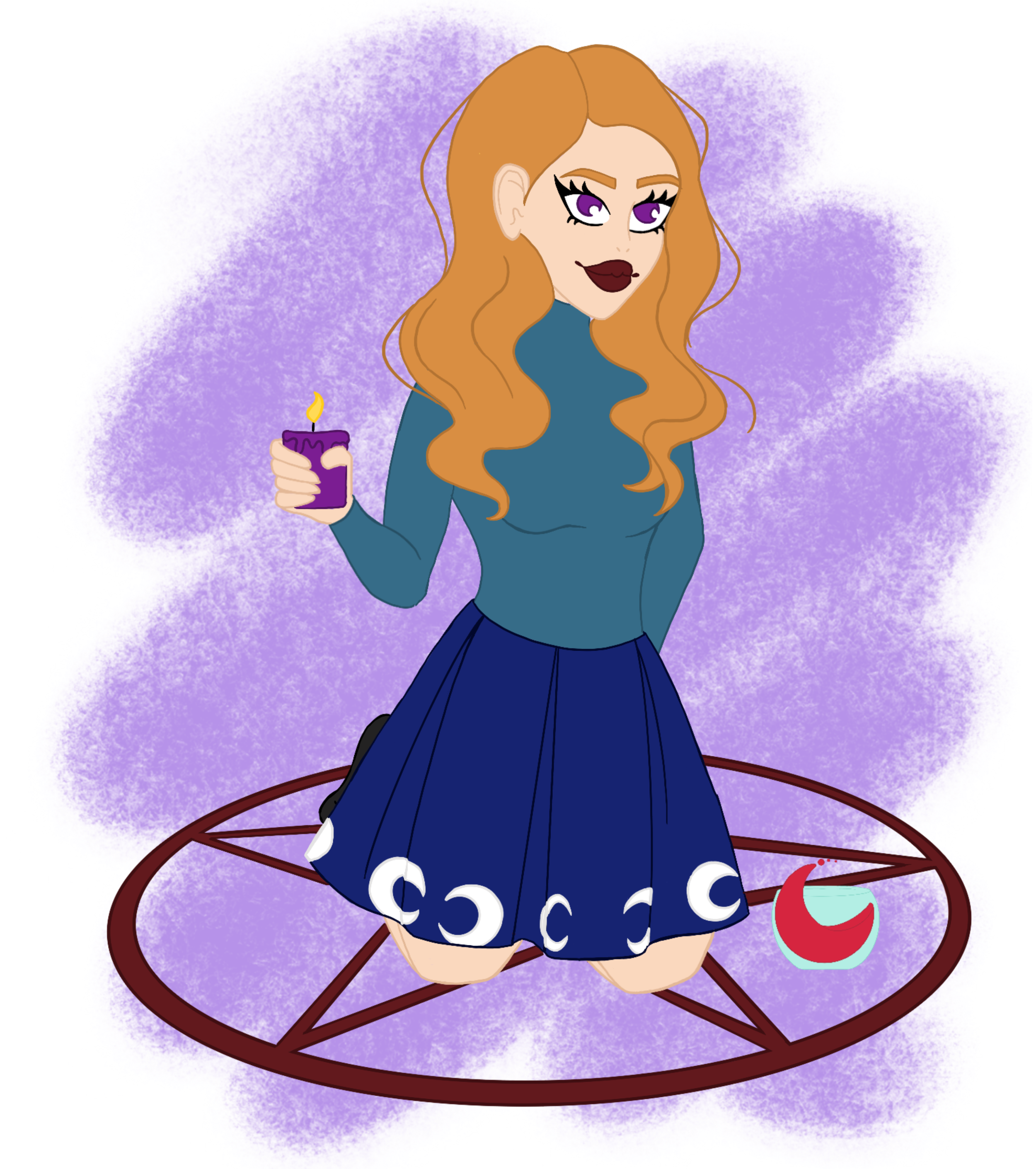
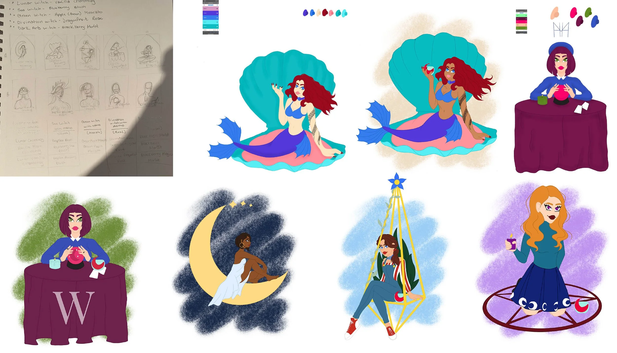
For the wine labels, I drew inspiration from different types of witches to represent the various flavors. Rather than using the stereotypical witch imagery on every bottle, each label features a unique witch character designed to reflect the personality of its specific flavor, helping to create a more engaging and memorable brand identity.
Research Synopsis
Witchin’ Wine is primarily targeted toward women between the ages of 21 and 65, with a stronger focus on the younger portion of this demographic. The brand also appeals to individuals who practice witchcraft, are interested in witchcraft culture, or are drawn to mystical and alternative lifestyles. Witchin’ Wine is designed to attract wine enthusiasts who appreciate fresh, natural ingredients and simple, approachable flavor profiles. In addition to its core audience, the winery aims to appeal to visitors and tourists passing through the area who are looking for a unique and memorable wine experience. While the primary target market is women aged 21–65, Witchin’ Wine is ultimately intended to be an inclusive brand that can be enjoyed by anyone aged 21 and over.
Target Audience
Process Narrative
Logo
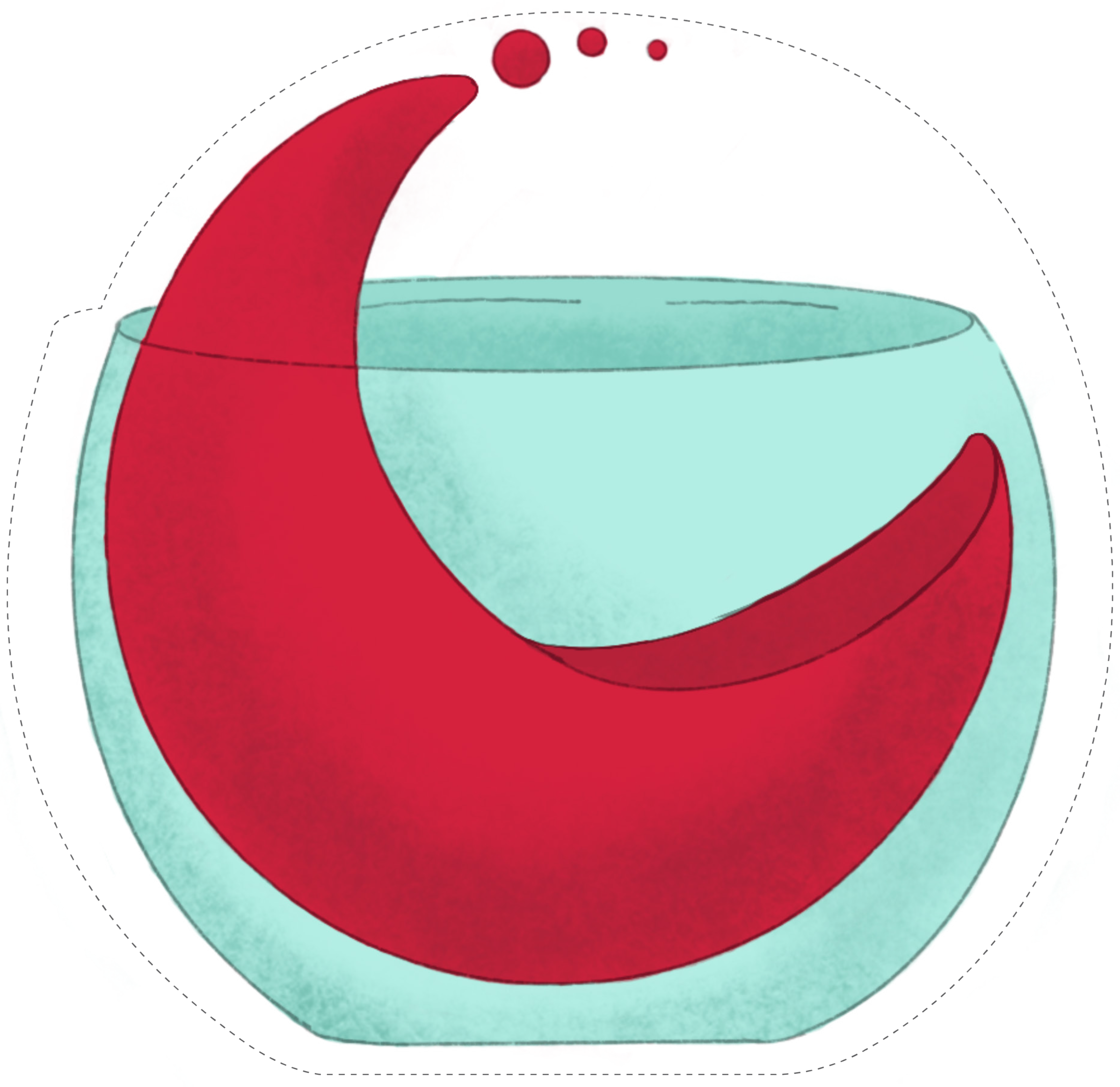
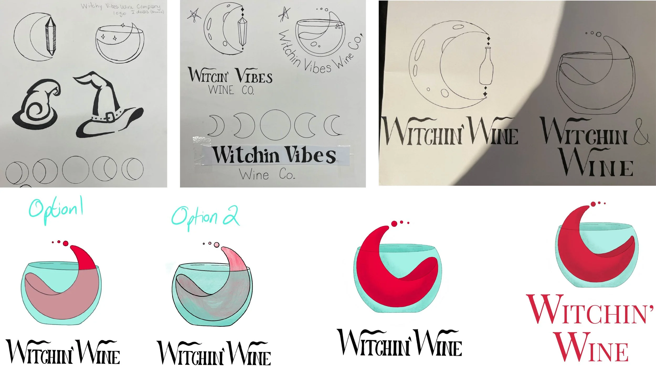
Before beginning the full project, I needed to develop a logo that would establish the visual tone of the Witchin’ Wine brand. I started by creating thumbnail sketches and initially explored common stereotypical witch imagery. After exploring those ideas, I shifted my focus toward elements more closely connected to Wiccan culture, such as phases of the moon, crystals, and nature.
The concept that resonated most was the moon, which I then combined with a wine-related visual element. I thought about how wine naturally curls and flows when it is poured into a glass and used that motion as inspiration. Instead of using a traditional stemmed wine glass, I incorporated a stemless glass to maintain a smooth, continuous curve within the design.
Once the graphic element was established, I needed a typeface that would complement the concept. I wanted a typeface that felt whimsical yet refined to match the brand’s personality. After experimenting with several options, I selected Playfair Display, which provided the elegant yet distinctive look I was aiming for.
Bottle Labels
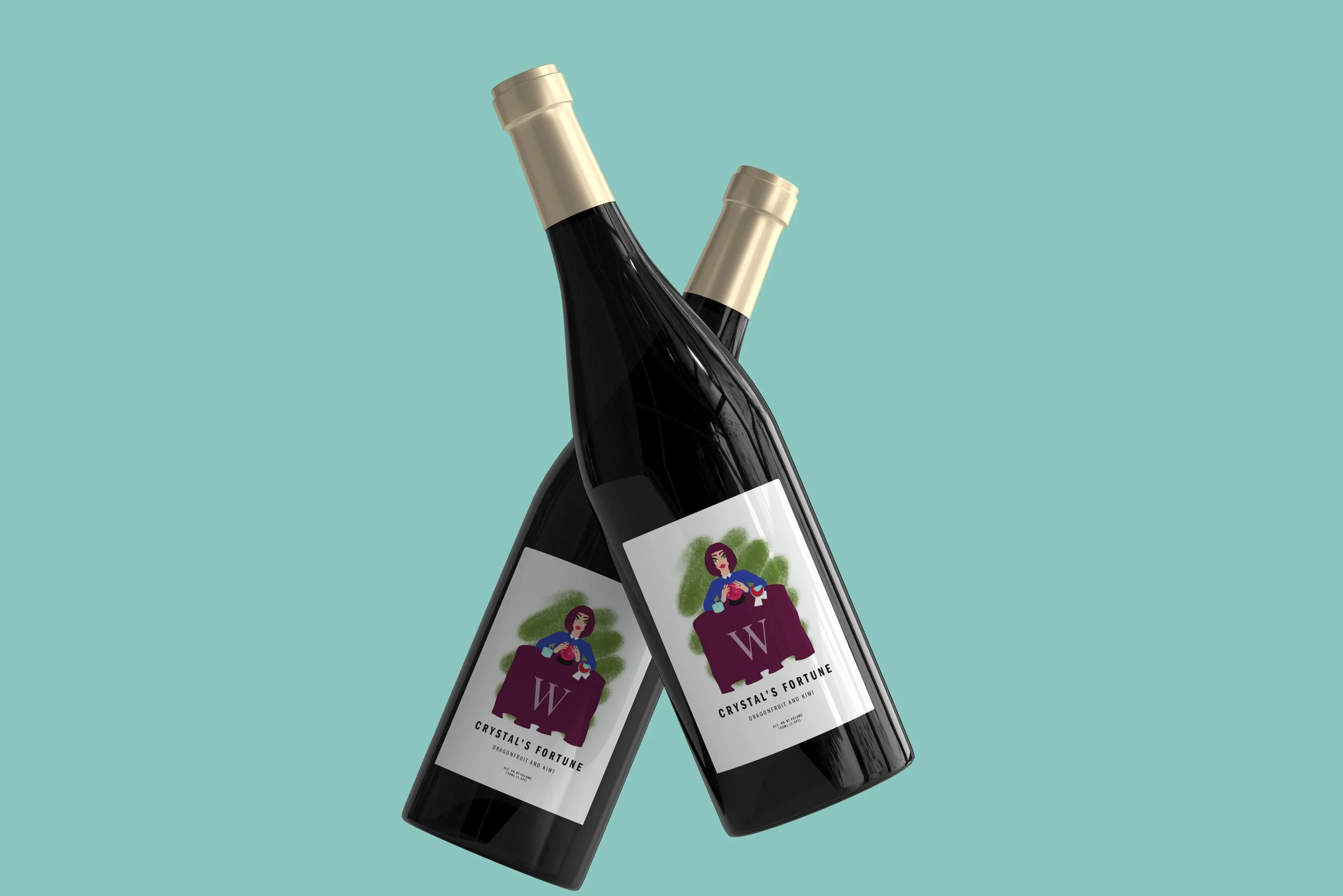
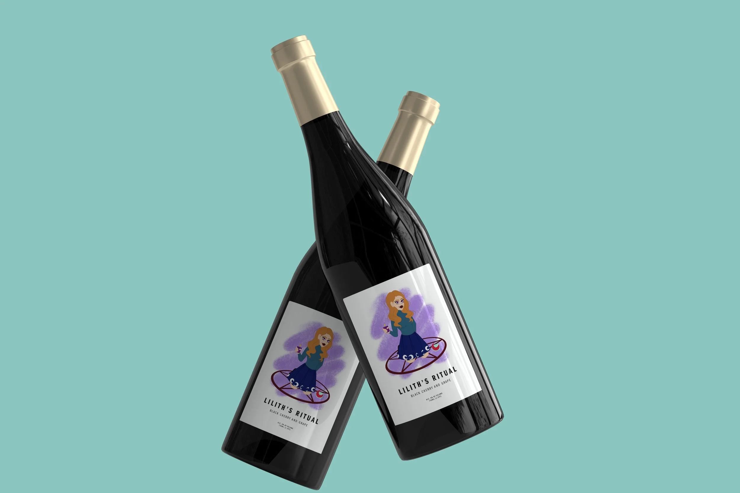
From the beginning of the project, I knew I wanted the wine labels to feature illustrated characters that embodied different types of witches. During the thumbnail phase, I explored two directions: full-body illustrations with environmental elements and simple portrait illustrations of each witch paired with its corresponding flavor. I ultimately chose the full-body illustration approach because it created a stronger visual narrative and gave each label more personality.
After completing the line work, I focused on developing the color palettes. Each wine flavor was assigned its own color scheme to help customers easily distinguish between varieties. For the typography on the labels, I selected a font family with multiple weights to create variation and hierarchy. The typeface was intentionally thin and vertical in proportion to reflect the shape of a wine bottle and to contrast with the wider, more expressive typeface used in the logo.
Website
While researching other winery websites, I noticed that many of them felt static and minimally designed. I wanted the Witchin’ Wine website to stand apart by incorporating a clear grid system and maintaining strong visual organization throughout the entire layout.
Another important goal for the website was to create a sense of community. I included a social component where visitors could interact with others who share an interest in witchcraft or where newcomers could learn more about Wiccan culture from reliable sources. The overall visual style of the website was designed to feel crisp, clean, and modern while still reflecting the fresh and natural qualities of the wines.
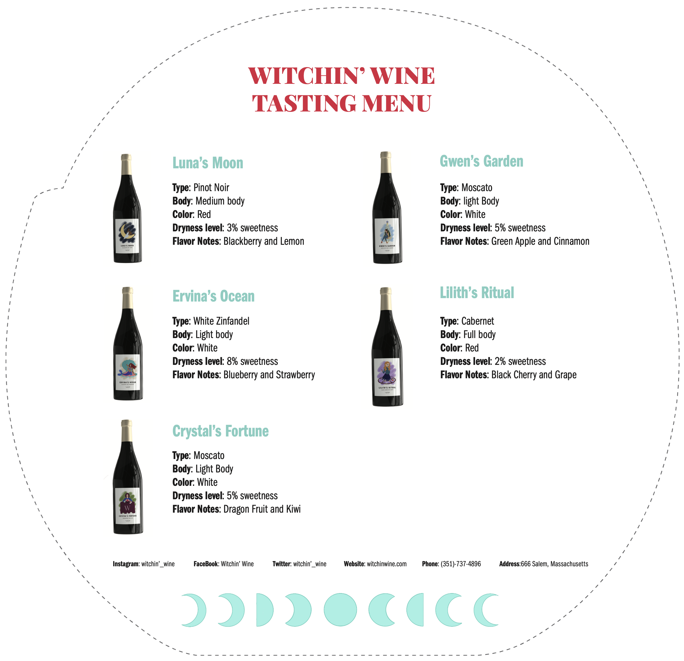
Tasting Menu
At the start of this stage, I was unfamiliar with tasting menus, so I began by researching how they are typically used within wineries. I decided to design the tasting menu around a “If you liked this, you may also enjoy…” concept. The idea was that the tasting menu could be included with a purchase or provided to customers after buying a bottle so they could explore additional options offered by the winery.
To reinforce the brand identity, the tasting menu was designed in the shape of the logo rather than as a standard rectangular card. One side features the logo, while the other side provides information about the wines along with recommendations for similar flavors.
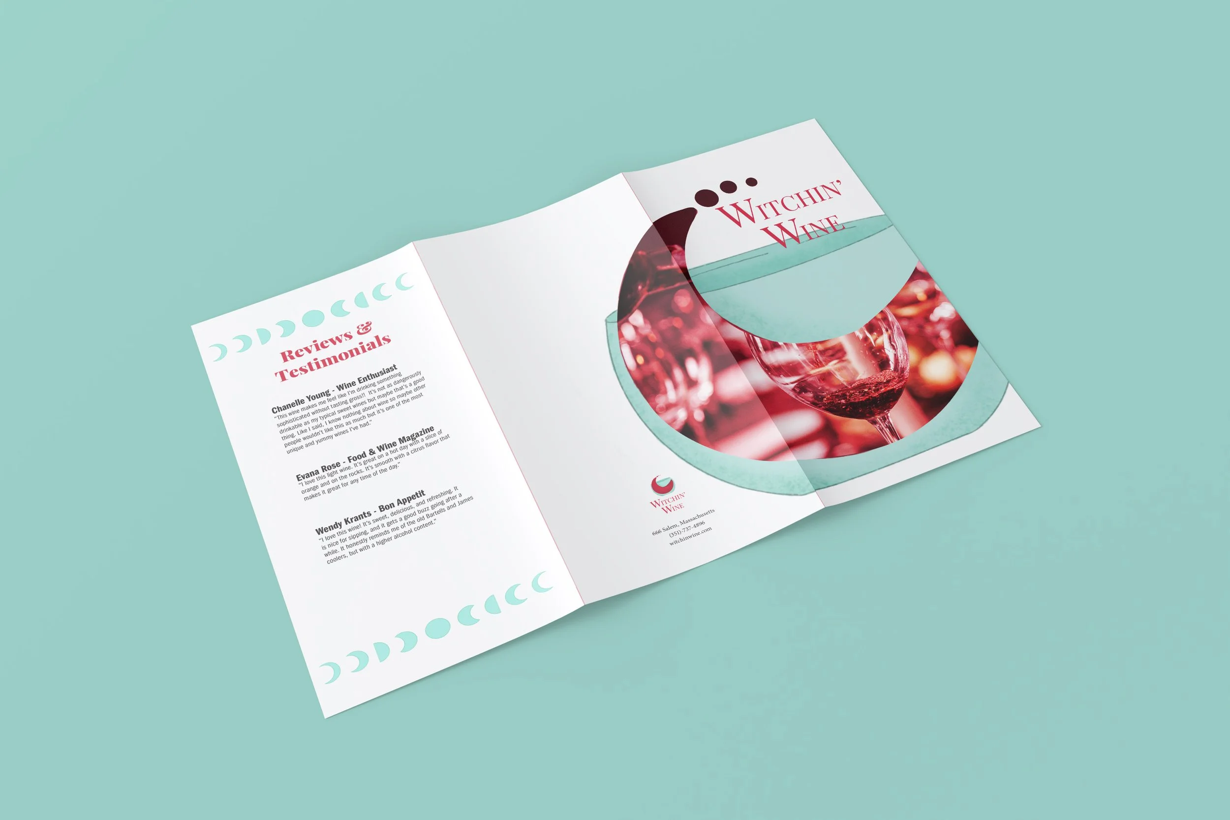
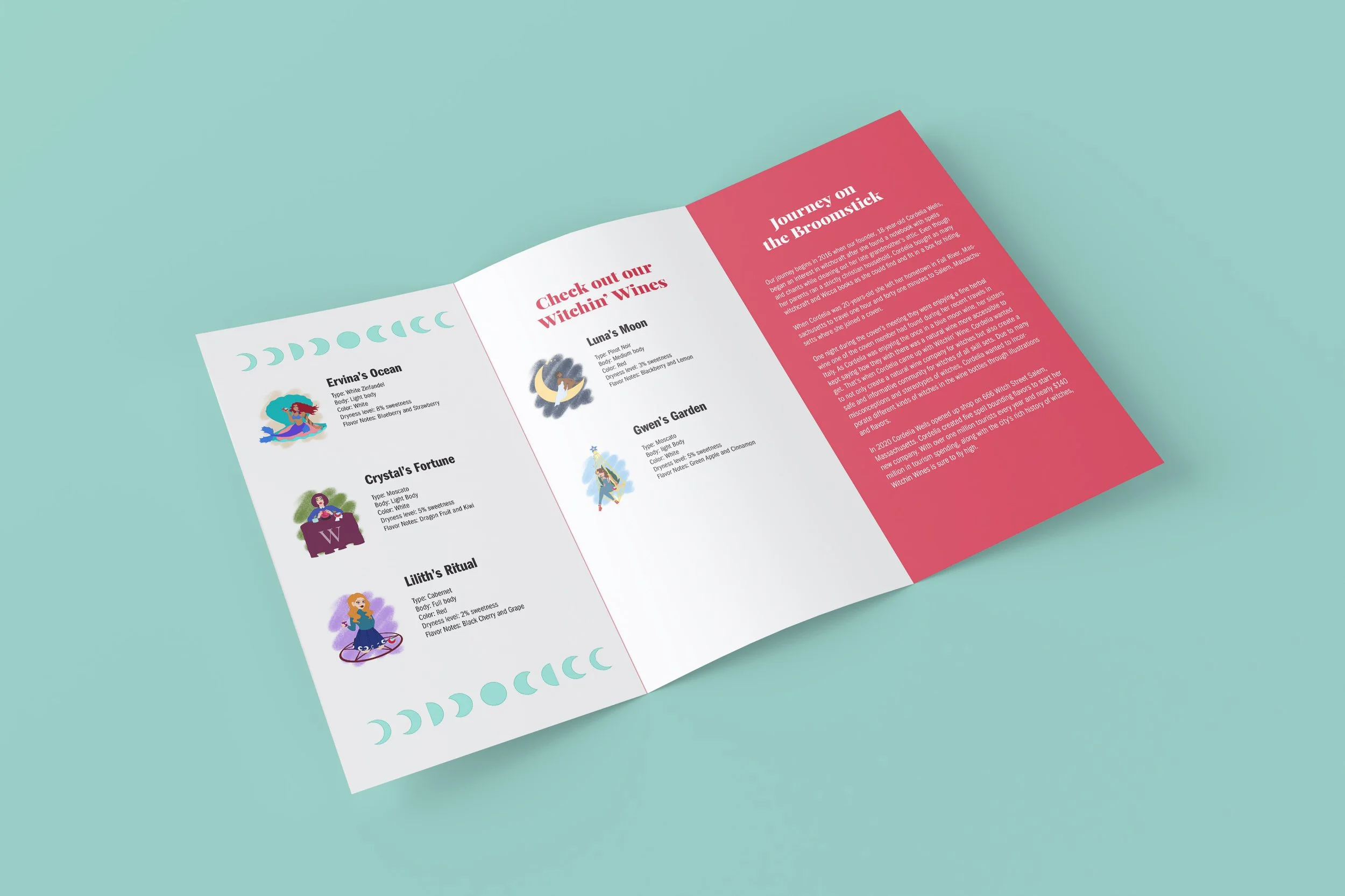
Brochure
The brochure was designed to provide visitors with an introduction to Witchin’ Wine, including information about the company’s origins and the wines currently offered. The initial collection of wine flavors was included because these varieties represent the launch of the brand.
The brochure also features professional wine reviews to help establish credibility and trust in the product. For the cover design, I used the logo along with an image integrated within the wine portion of the graphic to create visual interest. Using the logo as the primary element instead of a large photograph allowed for more flexibility and space for typography throughout the layout.
Witchin' Wine
666 Witch Street Salem, Massachusetts
Established in 2020
Witchin’ Wine was founded in 2020 in Salem, Massachusetts by Cordelia Wells. The idea for the winery originated during a coven gathering, where Wells and her fellow practitioners discussed the desire for a more accessible and natural wine option. Inspired by this conversation, Wells developed the concept for Witchin’ Wine and launched the company with five signature flavors.
In addition to producing natural wines, Witchin’ Wine strives to foster a supportive and informative community for witches of all backgrounds and experience levels. The brand embraces the values of the Wiccan community, including a deep respect for nature and a commitment to protecting and preserving the environment for future generations.
Witchin’ Wine also actively supports social causes that align with the company’s values. A portion of the winery’s profits is donated to organizations focused on environmental conservation, LGBTQ+ advocacy, and initiatives that promote human equality.
Despite being a relatively new company, Witchin’ Wine has already begun to gain recognition within the wine industry. The brand has been nominated for the Decanter World Wine Awards and has received positive reviews from several well-known wine enthusiast publications.
Witchin’ Wine distinguishes itself from other wineries by prioritizing community, sustainability, and inclusivity alongside quality wine production. The company was founded not only to create natural wines for fellow witches and wine enthusiasts, but also to build a supportive space for individuals seeking connection, knowledge, and guidance within the community.
Organization Profile