A Lecture by Ray Cruz
Typography Posters
Project Scope
For this project, we were tasked with selecting one serif and one sans serif typeface to design posters promoting a lecture focused on each font. The goal was to highlight the distinctive characteristics of each typeface and emphasize what makes them visually unique.
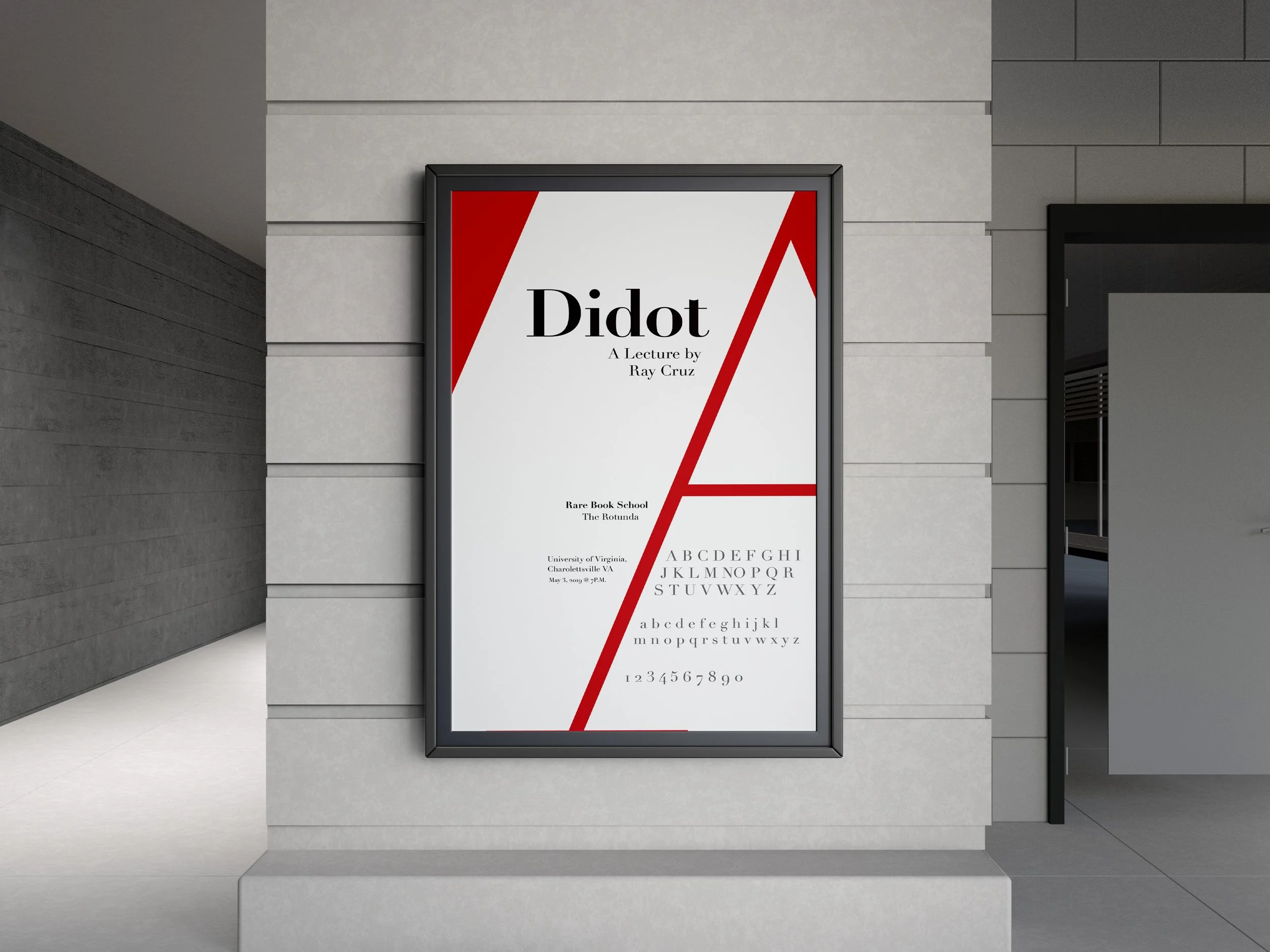
For my serif selection, I chose Didot because of its dramatic contrast between thick and thin strokes. This high contrast creates a sense of elegance and sophistication that immediately stands out. To reinforce this refined aesthetic, I used a white, red, and black color palette, allowing the typeface to feel bold, classic, and visually striking.
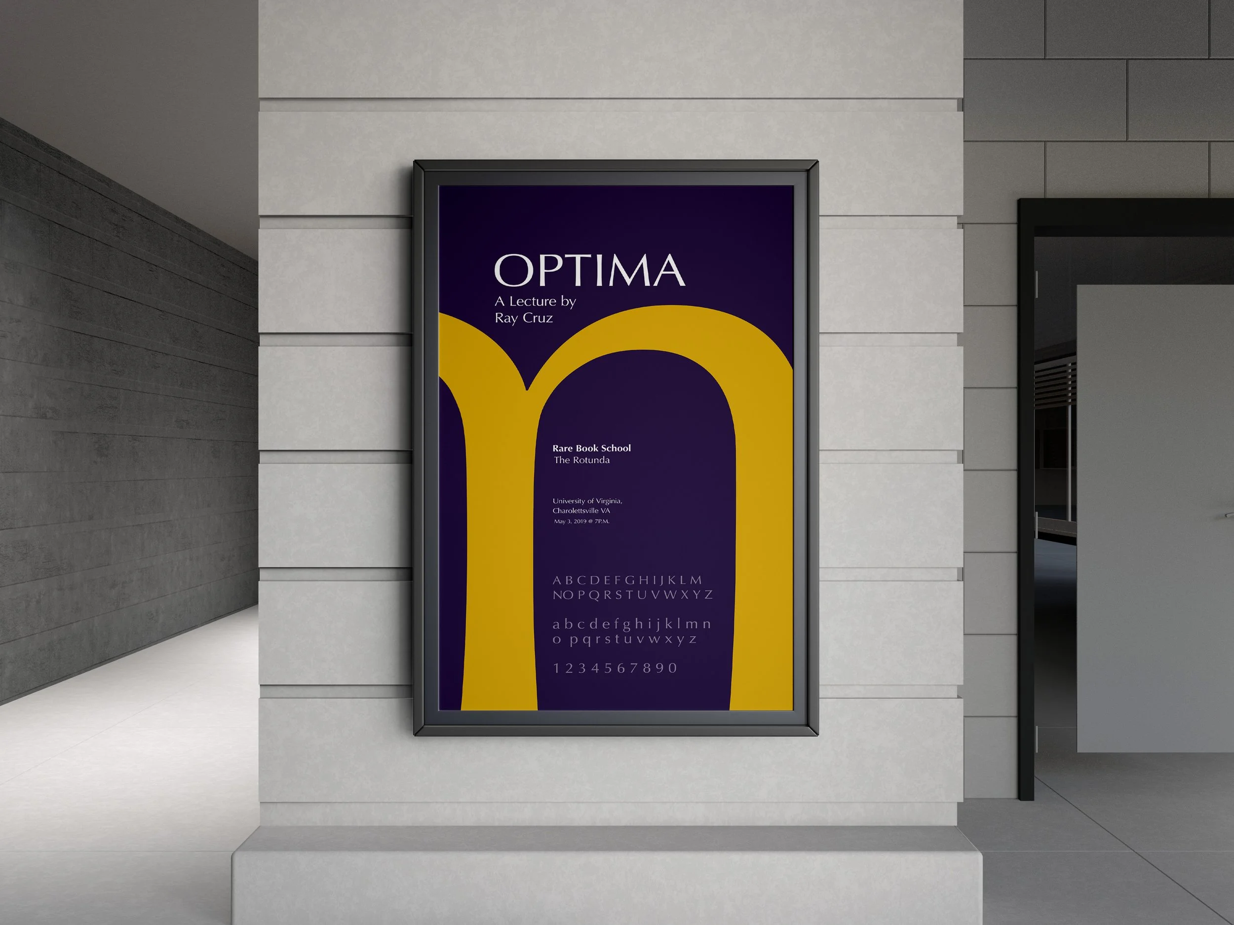
For my sans serif selection, I chose Optima due to its distinctive tapering within the letterforms. Although it is classified as a sans serif, these subtle variations give it an almost classical, old-style quality. To reflect this unique blend of modern and traditional, I incorporated a gold-toned yellow paired with its complementary color, purple, creating a rich and balanced visual composition.
Overall, both posters focus on showcasing the personality of each typeface through thoughtful use of form, color, and contrast.
Deliverables:
Serif Poster
Sans Serif Poster